Hello! Today I’m excited to share two cards with you to highlight the new release from Concord & 9th. I’m joining their Feature Friday series with the Stripes & Sayings stamp set. This is a super fun set with possibilities limited only by your imagination, and I happen to love the font on the sentiments, too.
I’m going to talk a little bit about the evolution of these cards, as it helped me to learn a bit about the inks and the stamp, and changed the way I made the second card.
I started off by choosing six Distress Oxide inks, in rainbow colors, naturally. I had planned to stamp three stripes from the main stamp image in three colors in one direction, then go on to three colors in the next direction. However, oxide inks are more opaque than dye inks, and I realized that that wouldn’t work very well. Or, it might work, and just make a hot mess.
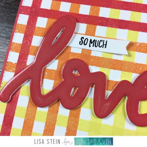
So, on this first card, I stamped three stripes in red, then orange, then yellow, then turned the card 90 degrees, and did the same stamping in the same order, rather than go on to the green blue and violet. I think this is a neat look, and like the way it turned out.

To finish this card, I stamped the sentiment on a banner that I cut from the Laurel Frames die set. I die cut the “love” from Hearts & Love three times from white cardstock, and one time from a piece of white cardstock that I had colored with Candied Apple oxide ink. Once I adhered those on top of each other I used versamark and clear embossing powder on the die cut to give it this glossy look.

For this version of the card I switched to Hero Arts inks. I chose three of the four blues that come in a set of ink cubes, figuring Hero Arts had already done the work for me. And also because I need to swatch my Hero Arts inks and haven’t done that yet. 😉

I did the same technique for the first set of stripes. Three in each color, darkest to lightest. When I turned the card 90 degrees I decided to only use the lightest ink in this direction. This is because my stamp was stained from the darker inks, and I suspected that if I used the lightest ink, since it’s the same formulation, it would remove part of that remaining ink and sort of blend it into the stamped image. I was right. You can see that on the horizontal on this blue card, I only used the Soft Pool ink, but towards the bottom of the card, the stripes are darker because it picked up some of the dark ink that was already on the stamp. I learned this from a stamping incident a while back, but somehow I kept this in my head and was able to use it to my advantage this time.

Here’s a closer look at the inked and clear embossed sentiment here. I used the Soft Pool ink on white cardstock for the top layer of this, and it’s such a pretty look with all that shine. I absolutely love this line of dies from Concord & 9th and want them for all words. Well, all words that I would use as a sentiment.

Here they are together, I love the fun graphic style of these, and want to make more in all of the colors.
Thanks for stopping by today, I hope you’ve been inspired to get inky. As I type this I still have some blue ink on my fingers; many hand washes and two showers later. Eep!
Supplies:
 Stripes & SayingsEH | SSS | C9 |
 Laurel Frame DiesEH | SSS | C9 |
 Heart & LoveEH | SSS | C9 |
 Candied AppleEH | SSS |
 Spiced MarmaladeEH | SSS |
 Squeezed LemonadeEH | SSS |
 NavyEH | SSS | HA |
 Soft PoolEH | SSS | HA |
 PoolEH | SSS | HA |
 VersaFine Onyx BlackEH | SSS |
 VersaMark PadEH | SSS |
 Hero Arts ClearEH | SSS |
 Neenah 110 lbEH | SSS |
 Teflon Bone FolderEH | SSS | AZ |
 ATG AdhesiveEH | SSS | AZ |
 Powder ToolEH | SSS |
 Zig 2-Way Glue PenEH | SSS |
 Be Creative Tape, 1/8″EH | SSS |
 Foam TapeEH | SSS | AZ |
 Embossing GunEH | SSS |
 Stamp ShammyEH | SSS |
 MISTIEH | SSS |
 Craft SheetEH | SSS |
 Rubber BrayerEH | SSS |
 Craft PickEH | SSS | AZ |
 TweezersEH | SSS |
 Paper TrimmerEH | SSS |